An old poster I made from two years ago
Mission
I took the opportunity to redo my old poster with the skills I have now. It would be great to show my audience (potential employers) and peers my growth, creative-wise, from the thought process to the final product.
For the redesign, I wanted to focus on the product's emphasis on summer and how to express that using Art Nouveau elements. So, when I thought of summer with Ramune, it’d be like a refreshing relief to chill on a hot day.
Four thumbnails for the redesign
Design Process
For the redesign, the poster would feature a fairy sitting serenely on top of an unopened bottle while listening to the wind chimes in the background. I replaced the sunflowers with hydrangeas for the framing and the stiff typefaces with fluid, rippling letterings that spelled "Ramune."
I experimented with cool color tones with more attention to different aspects of the composition. For example, the ramune soda is drawn and colored in deep violet-blue tones to contrast itself with the lighter hues from the background and the title.
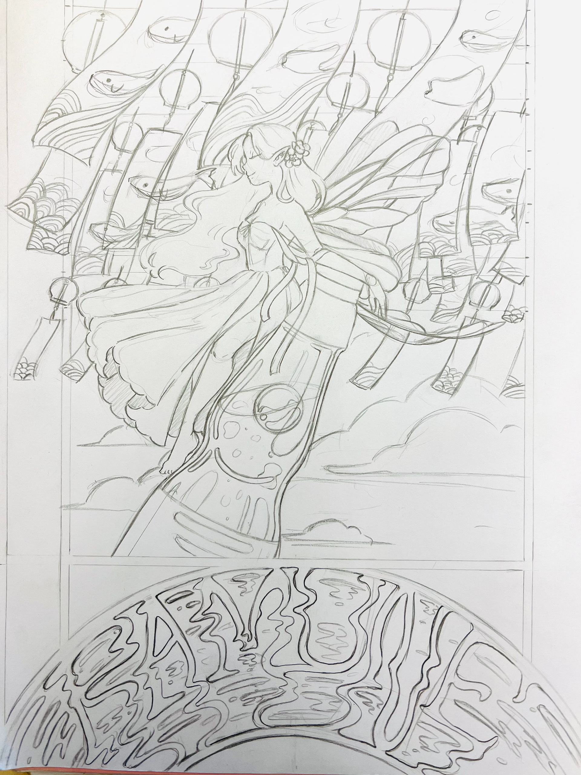
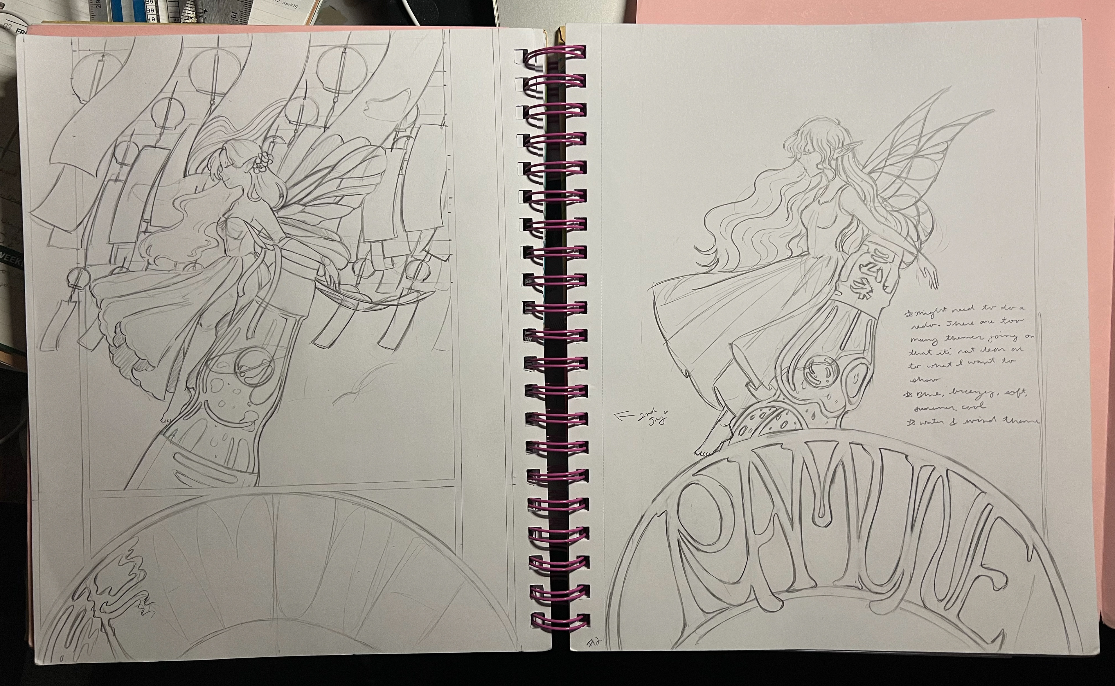
Outcome
It wasn't easy to create an entirely new composition to redo my previous one, yet I'm honestly proud of myself for taking on the challenge and recognizing the amount of growth I have done as an artist and designer. Still, there's so much to learn in the future, and maybe, two years from now, I might redo this poster again and see where it takes me.
The Final Result
Advertisement Poster Mock-up
